By GUPPI
Causal inference is used to determine whether an action on a selected population is efficient and by how much. It is extremely useful to evaluate the average treatment effect of a campaign. For this, you need to compare the outcome difference on a treatment and on a control group.
In this post, we explain techniques that can be used to evaluate an action even when a proper control group does not exist. We will explain how causality can still be inferred and tested and how much we can deduct from the data.
This post builds on the case previously explained in part 1 of this series.
Quick recap
As mentioned in the part 1 of this serie, we did not have any idea whether the campaigns were aimed at reducing churn, nor did we know how the assignment of clients to the treatment and control group happened. Furthermore, the control groups already in place were much smaller in size than their associated treatment group and were not representative to assess correctly the effectiveness of the campaign. That is where the need to create synthetic control groups popped up. The goal is to find a control group population with similar characteristics (similar feature distributions) as the treatment group population.
Indeed, then the effect of the campaing is controlled for the other factors that could have influenced the outcome and a treatment effect can be calculated.
Synthetic control group techniques
We evaluated three methods: propensity scoring, coarsened exact matching (CEM) and OLS regression.
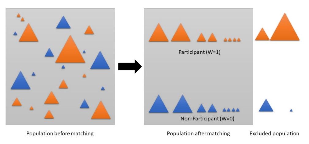
Propensity score matching first will estimate the propensity scores using logistic regression, discriminant analysis or other such techniques. The propensity score reflects the probability to receive a treatment based on the observed covariates (variables). Then pairs of treated and untreated subjects are formed in such a way that the matched pairs have similar propensity score values. As a consequence, untreated participants with the nearest propensity score will be matched with that test group participant. If the treatment was assigned at random, the propensity method would lead to a very similar score for all records. The control group would then be the whole untreated population.
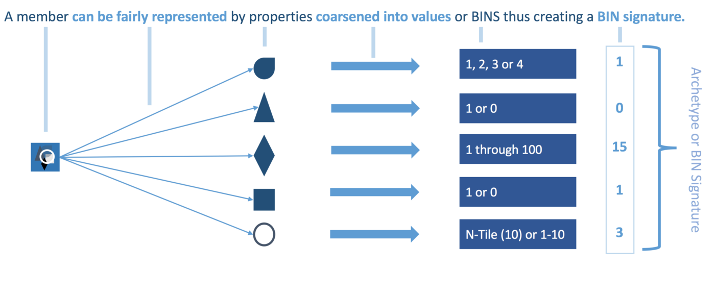
Coarsened exact matching (CEM) will first bin each variable. A member will then be represented by its bin signature that will be used to exactly match other members with the same bin signature. As a bin signature can have multiple associated treated and untreated members, the variance in distribution must be normalized using CEM weights. Every member will be allocated a weight. Unmatched participants will be assigned a weight of 0 and will hence be discarded. Matched treatment members will have a weight of 1 and matched untreated members will have a weight above 0.
Ordinary Least Squares regression (OLS) models the relationships between the treatment and the outcome as a linear model and estimates the average treatment effect by finding the coefficient for the treatment variable. In this case, the covariates will have the role to control for other possible factors that can impact the outcome, assuming again a linear relationship. Of course, you can add to this below equation the term of interaction between treatment and the covariates but we have kept this approach simple.
Y=α+βX+γA+ϵ
With α being the constant term, β the treatment coefficient, X the treatment variable, A the covariates included in the model (and γ their coefficients) and last but not least ϵ being the error term. The treatment effect will be given by β.
Preprocessing
We performed feature reduction as this gave us a faster and more stable matching process. Another reason why we did this was because we observed when using all features as-is on CEM, no matches were found since it becomes increasingly harder to find matching bin patterns with an increasing number of features, especially when these are sparse. We tried recursive feature elimination, feature selection based on the F-score between the feature and the target variable and PCA. We found that PCA with 15 components after rescaling delivered the best results (some experiments were run to match the groups, and the quality of the matches showed that PCA gave the best propensity scores and matching). PCA indeed reduces sparsity, rescales and yet captures the relevant part of the data
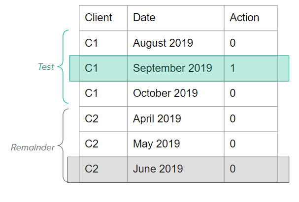
Subsequently, the data was split into a treatment and remainder group. The treatment group consisted of all clients that were targeted during that window of time by that campaign and the remainder group contained all untargeted clients. Since the treatment and remainder group were still in the sequential format (each client had a record for every month the contract was active), we subsampled them in order to reduce the size of these datasets and to make the matching process more stable and faster. We hence brought the treatment and remainder group back to one record per client. For the treatment group, we took for each client that record where the campaign took place. For the remainder group, we randomly took a sample per client.
Grouping of results
We then provided these 2 groups to the propensity score matcher (using the Pymatch library) and CEM (using the CEM library). Propensity score matching returned the propensity scores while CEM returned the CEM weights for each client. Based upon this output, we created four different group (as explained in the first blog post)
- Treatment group = the group that was targeted by a campaign and had a propensity score higher than 0.5, meaning that the population within this group had a high propensity of being targeted (high probability to churn). The CEM equivalent assigns the treated clients with a CEM weight of 1 to this group. This means that CEM chose these clients as they found a match for them with one or more of the untreated subjects.
- Random group = the group that was targeted by a campaign, but had propensity scores lower than 0.5, meaning that they had a low propensity of being targeted, but were targeted anyway. The CEM equivalent assigns the treated clients with a CEM weight of 0 to this group as this means CEM could not find a proper match for them with any of the control group subjects.
- Control group = the group that was not targeted by a campaign, however, that had a propensity score above 0.5 indicating that they actually did have a high probability of being targeted. The CEM equivalent for this group are the clients that did not receive a treatment, but were chosen to match the treatment group clients and hence have a weight above 0.
- Other group = the group that did not receive treatment and had low propensity scores (below 0.5) which means that indeed they did not have a high propensity of being targeted. For CEM this means that the untreated participants could not get matched to any of the test members and hence received a weight of 0.
The Good, the Bad and the Ugly

To evaluate the propensity score matching, we looked at two plots: namely the distribution plot of the propensity scores across treatment and control group. The more disparate these distributions of the treatment and control group are, the higher the separability of the data and the better the matches will be. This indicates that the treatment group had specific characteristics that can be identified by the algorithm and that the treatment was not done at random. Secondly, we will display the churn ratio per group over a course of six months (this will be done for CEM as well). Note that the churn rate value is not absolute, but reflects the difference between that month and the month before. To clarify, the churn rate is the percentage of new churners from that group in that month.
Simply by displaying these 2 plots, we will already be able to conclude a lot about the campaigns. In the following section, we will go more in depth in the statistical tests, to demonstrate and confirm significance of the results.
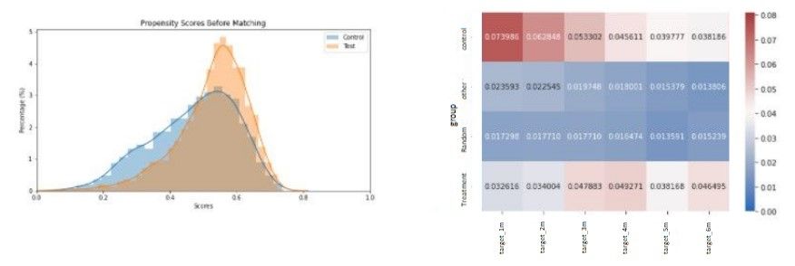
The results presented by the two plots above (figure 4) are aligned with the expectations. Churn is indeed higher in the treatment and control group suggesting that the campaign was in fact targeted at the high churn probability customers. The random group also follows our expectations as the customers targeted do not show high churn rates and so the effect of the campaign on churn percentages on this group appears to be minimal.
The benefit of plotting churn rate over a six month period is that we now can observe how long the campaign had an effect. In this case, we could see that the campaign had a significant effect lasting for two months. Churn rates then converged again around the third month with no more effect on the fourth month.
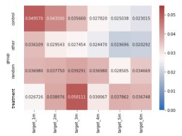
For CEM (figure 5), the interpretation of the four groups (especially the random and ‘other’ group) is less intuitive as this method does not return propensity scores specifying the probability of receiving a treatment. Hence, results can vary a great deal compared to the propensity method.
As the interpretation of the random and other group is a bit more opaque, we concentrate on the control and treatment group. Similarly to the outcome in propensity score matching, we see that churn probabilities of the treatment group is lower than those of the control group for the first two months. Hence, the campaign indeed had a lasting effect of two months.
From now on, we will refer to this campaign as the good campaign.
The results are not always as clear for the different campaigns. Looking at another campaign (cfr. figure 6), the results are already more mixed. This campaign will be called the bad campaign.
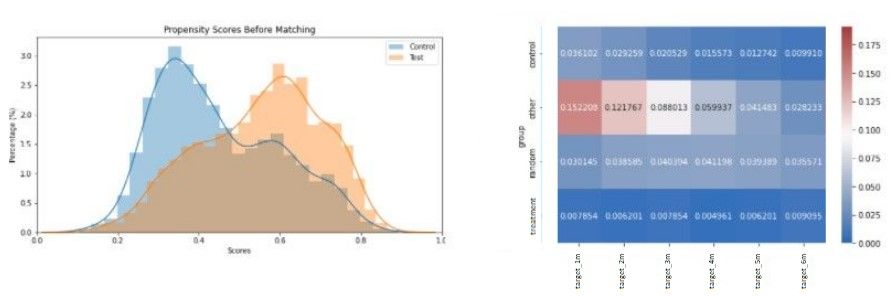
The above results give mixed feelings as the churn percentage in the ‘other’ group is much higher than in the other three groups. However, as the churn percentage in the treatment group compared to the control group is lower, we can say that the campaign had an impact on churn.
Although churn rate is definitely lower in the treatment group, the churn peak in the ‘other’ group does not seem to indicate that the campaign targeted the highest churn group. Consequently, it becomes difficult to conclude whether the campaign was targeted at the high propensity churners and if that campaign did have an effect.
In the next case (figure 7 & 8), we observe that the propensity score distributions of treatment and control group almost completely overlap. This indicates that there will be a high difficulty in splitting the customers which could result from high similarities between these customers of the test and control group (hence, we deducted that the assignment to test and control group was completely random).

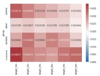
Looking at the propensity score outcome, the campaign seemed to have a little effect on both the treatment and random group as one can notice a very small difference in churn rate with that effect almost immediately fading away after the first month. However, CEM seems to disagree as little difference in churn rate can be found between the treatment and control group (in fact, the treatment group has a slightly higher churn rate), cfr figure 8.
And this campaign will be referred to as the ugly campaign.
Calculate significance
To assess the robustness of previous results, we estimated the causal effect and the significance of the campaign using ordinary least squares regression. In this case, the regressor models the propensity to churn given the treatment and all other covariates (PCA indicators).
For each campaign, we will present the treatment effect estimates (please note that a negative effect means a reduction in churn which is in fact a positive business outcome) and the stratification summary. The latter will bin the clients in different strata based on their propensity score. This means that the covariates of the treatment and control group within one stratum are balanced which makes the comparison more meaningful. This allows a more granular view on the treatment effects (outcome raw difference), on different splits of the population. Ideally, we would like to see that the bins with a low propensity score will generally observe a smaller campaign effect than the higher propensity bins. As a matter of a fact, if the campaign was targeted at reducing churn, the bins with a higher churn propensity should be affected more than those bins with a low propensity to churn.
The Good
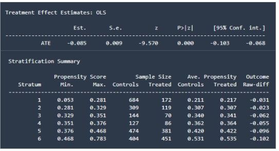
And we are off to a good start. The OLS results nicely agree with the ones found by applying the propensity score matcher and CEM. As previously mentioned, the campaign had a significant positive impact on churn in this period (as indicated by the P-value). The stratification summary as well perfectly showcases the results found earlier. The higher the propensity scores, the more effect the campaign had on churn. This confirms that the campaign in this period was aimed at reducing churn and had a positive impact.
The Bad
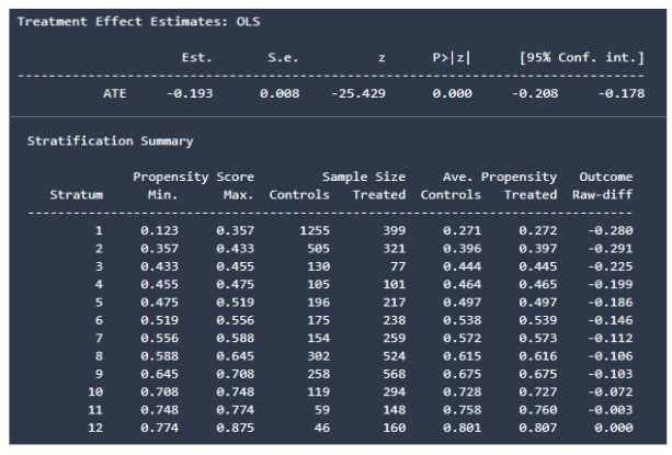
First, we find that the campaign had a statistically significant positive impact on churn (reduction of churn) which is reflected by the P-value being zero.
However, the results of the stratification summary are counterintuitive as the campaign did not have any effect on clients with a high propensity score. Actually, the higher the propensity scores, the less effect the campaign seems to have. This reinforces the idea that the campaign in this period did not target the highest churn group. We can also see a higher effect on the lower propensity score bins which indeed agrees with the higher churn rates we saw in the ‘other’ group after propensity score matching. So here too, OLS confirms our conclusions drawn with the synthetic control group methods.
The Ugly
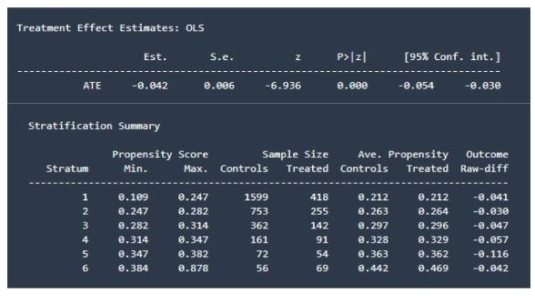
Here, we can also draw a parallel with the findings from the synthetic control group methods. The campaign does have a significant positive effect on churn. Looking at the stratification summary, we cannot find a logical order in the raw difference of the outcome. The campaign does not seem to have a better effect on the population with higher propensity scores compared to the effect on the lower propensity score population. This strengthens our belief that the test and control group customers are highly similar.
So for all three periods, the causal inference methods delivered similar results and findings as the propensity score matching outcome. This reinforces our belief in this matching method.
An interesting implication of these different strata is that we could use them as a simple baseline to recommend an action. We could for instance target the customers within the final couple of buckets (hence having a high propensity score and a higher chance of responding well to the campaign).
Disclaimer on causal inference
Other methods
We tried three different techniques here to estimate the average treatment effect, but of course, there exist plenty more methods you could try such as doubly robust estimator, difference-in-difference, Synthetic Control Methods or one can even use machine learning algorithms to determine this.
For more details, we would like to refer to the immensely helpful Causal inference for the brave and true handbook.
Conclusion
To summarize, we tried three different techniques to assess whether the campaigns were in fact targeted at reducing churn and if they had a positive impact on churn. In the end, all three methods seemed to more or less agree on the impact of the campaigns. Unfortunately, not all results were as good as hoped for (e.g. the bad and ugly campaign) and not all campaigns hence seemed to be targeted at reducing churn (or did have a positive effect). This will hence also have implications when training a reinforcement learning model. Ideally, the reinforcement learner will discover which campaigns actually had a positive effect and will only recommend these and discard the more confusing campaigns where the results were quite mixed.

