By Lode Nachtergaele
Machine learning engineers are at the intersection of programming (computer science), math/statistics/machine learning and domain knowledge/communication. Although a lot of progress has been made in the first two, their advances are constrained by the ability to convey their results to the business owners of a problem. Graphical representation can be of enormous help to bring over complex results. In this blogpost, we discuss latest trend in visualisation of statistical results. State-of-the -art and more advanced techniques are discussed by Tim Leers in "Trends in XAI tools & research at NeurIPS 2021".
This month, the #30DayChartChallenge challenges the community to publish a themed chart everyday. Day 12 theme is about The Economist styled graphs. Although a lot of charts in the challenge are made in R with the library ggplot, I tried to use a more Pythonesque library called Altair. On my personal blog, I reconstruct step by step a graph that was already improved by Sarah Leo:
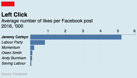
Imperative plotting libraries, that expect to specify the "how", have produced high quality print/publication level charts in the last decades. For instance, the first picture of a black hole was made with matplotlib. I was uncertain if declarative approaches to visualisations are up to the task. The declarative approach does a lot for you out of the box and has a lot of good practices build in. This gives great support for explorative data visualisation. But sometimes, you want to go beyond the template for a very specific reason. In that case, the declarative approach could fight against you. I hope to convince you with the above chart and the many examples in Altair's gallery, that Altair is perfectly capable in creating high quality graphs. Only the very last details (fonts, text labels to draw attention, ...) could sometimes be better handled by vector editing tools such as Adobe Illustrator, Figma or Inkscape.
Could we further improve the Economist bar graph ? John Burn-Murdoch (Stories, stats & scatterplots for @FinancialTimes) wrote on twitter:
Among other brilliant things in that study, the authors used eye-tracking to see what people look at when they look at a chart, and the answer was:
— John Burn-Murdoch (@jburnmurdoch) April 13, 2022
Words first, then plot.
Get your title wrong (or worse still no title), and your chart is trash. pic.twitter.com/6xWjI8jma9
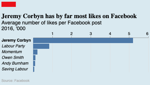
So we could improve the bar graph by adding a clear title:
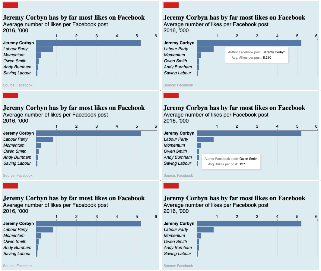
Or using Altair, it's trivial to add interactivity via tooltips:
Another wonderful chart published by Colin Agnus on Day 12 of the challenge is:
#30DayChartChallenge
— Colin Angus (@VictimOfMaths) April 12, 2022
Today's theme was to make a chart in the style of @TheEconomist
Here's a look at the age distribution of deaths from alcohol, suicide and drugs in England & Wales and Scotland. pic.twitter.com/gGsRB2RVZt
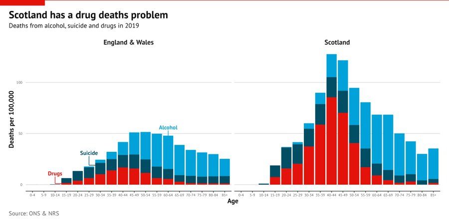
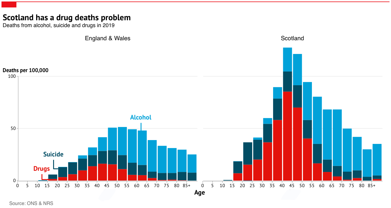
This beautiful chart has a very clear message that is visually well supported by form and aesthetics. However, in my humble opinion, it can be further improved in three steps. First, moving the vertical label of the y-axis to the top of the y-axis and make it horizontal. No more head turning needed to understand the y-axis. Second, I reduced the data to ink ratio by replacing the bins on the x-axis with only the start number of the interval. For example, instead of centering 60-64 under its bar, we only display 60 centered between two bars. This is the result made in Altair:
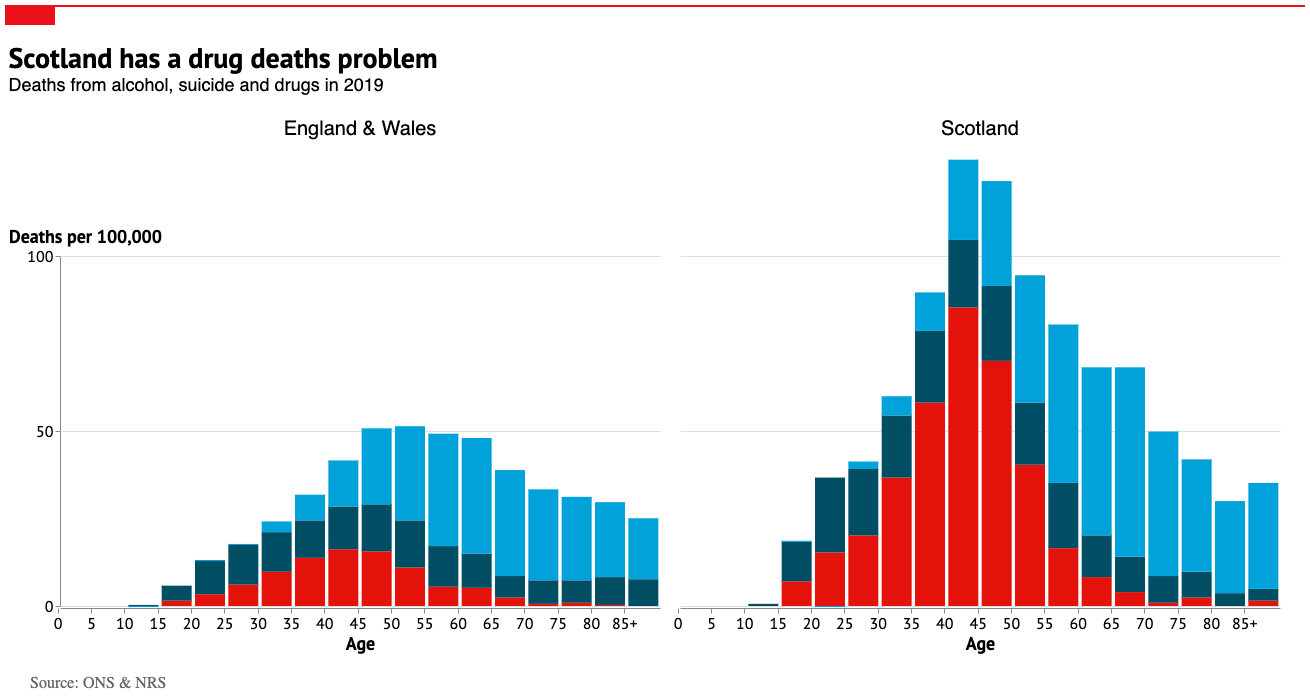
Thirdly, in a vector editing tool (Pixelmator Pro in my case), I added the explanation of the series and removed the double mentioning of Age on the two facets of the graph and replaced it by one. Combining the three steps gives:
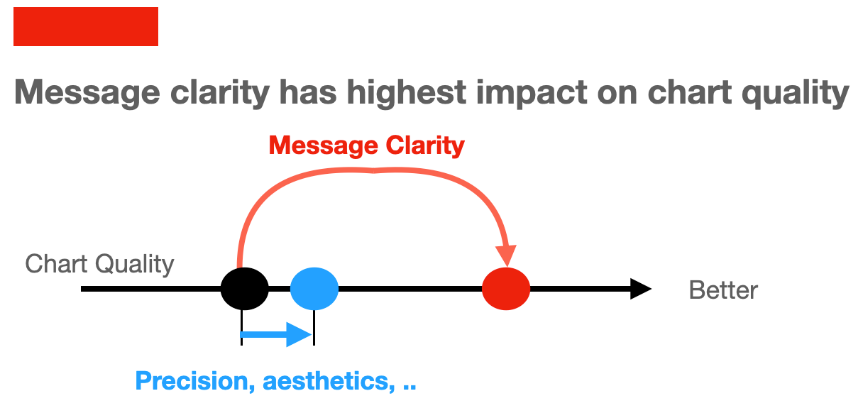
With the two Economist styled examples in this blogpost, I hope to make clear that graphical visualisation can be improved by using clear text and interactivity:
The choice between R's ggplot, Python's Altair, ubiquitous Excel or whatever tool is of secondary importance. But if you prefer something in Python, I recommend Altair as it's a wonderful piece of software that is fully up to the task. It gives you interactivity with very little extra effort and hence opens a lot of new innovations in communication about data. Something very dear to out hearts at dataroots.

